Robert's Advanced Portfolio
Friday, 17 December 2010
Evaluation
In what ways does your media product use, develop or challenge forms and conventions of real media products?
The use of the main conventions will be different in each music video as the beats and the style of music are different. Each music video will use the same conventions to keep the viewer on the video, each genre of music will have the same conventions but some will use more, more often. Such as dance music might use faster cutting shots and bright lights more than rock music, as the type of music may be more upbeat. I think that in every music video there has to be a section in the video that has fast cutting shots to keep the viewers entertained so they carrying on watching the music video, by having fast cutting editing they will get through more video clips that they shot so the viewer may understand it more. Also when they use faster cutting editing there will have to be more camera use, which will mean there will be lots of different shot types, angles and zooms. I think that the repeatability of some shots is one of the main conventions in music videos. But in some genres of music videos they will repeat shots more than they do others. I think that music that contains lyrics about loving/missing someone will use repeat shots rather a lot more than dance/dubstep music videos. This is because if they are missing/ love someone they will want to repeat shots that will act like past memories. Another convention that is important to music videos uses the star/artist. Richard Dyers Theory on stars. More professional artists will make sure that they are in the music video as popular artists for R&B, Pop, and Rock genres will have groups of fans that will watch and listen to the music just because the star is involved. But with certain Genres such as dance and dubstep the name of the artist is more important that seeing the artist, this is because DJ’s rely on the music to become more popular than the star image. As DJ’s aren’t used in magazines and music awards as much as the popular artists in the pop music genre. This is because the pop music artist are trying to sell their selves and their music, whereas DJ’s are just trying to get there name around to sell their music and become more popular around the world. But personally, I think that the use of the main media conventions do depend on the genre of the music video as some genres of music will use more fast cutting shots and camera use, and other music videos will use slow long shots that contain more shots of the star, but it depends on the type of music and the beats of the music.Andrew Goodwin’s theory that there is a relationship between the lyrics and the visuals and a relationship between music and visuals are used so that the viewer can listen to the song and have a visual image of what can happen in the music video. This theory is used is mostly all genre types of music videos as a basic outline of the video will be following the lyrics and what is happening in the song lyrics, by having a music video it will just show you what is happening during the music.
The main conventions that are used in the dance/dubstep genre will be fast cutting edits, lots of different camera use and many different camera zooms and angles and it usually is either inside or dark with bright neon lights. The music videos for this genre uses fast cuts as the beat is fast and they try to follow the beats by changing and editing shots quickly to keep the viewer entertained. While cutting quickly they will be using loads of different camera shots, which will involve different shot sizes, zooms and angles, by changing the shots this quickly will help follow the beat and keep the viewer interested. Also while it is doing this it shall be showing other parts of the scenery or other things happening in the background which may be vital to the music video. The reason why dance/dubstep music videos use dark places to film is that when I have watched a music video of this genre they will use shots inside a club while they are DJ’ing. When shots like these are taken they are usually taken when a DJ is genuinely playing, which means they don’t need actors and the dancing isn’t staged. I think that with the dance and dubstep genre, music videos are usually less based on a storyline as these types of music have less lyrics to follow, this is why in the music videos the shots only last for a few seconds at max as everything is fast. Camera use is very important as the angles are important. I think that Richard Dyer’s theory doesn’t fit in with this genre as the star/artist isn’t used that much at all, if anything at all. This is due to the DJ just wanting to get his name around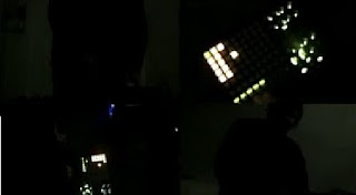 so people visit the clubs he/she plays at, some DJ’s are used in their music video, but this is usually a few shots of him playing his decks in front of an audience. Like in my music video, Aidan and I decided to use Dub Fiend himself playing his decks as if he was in front of a crowd.
In some types of music video’s in this genre, Andrew Goodwin’s theory will link into some videos. This is because some music within this genre will have lyrics in, like Aidan and mine, we were able to work with the lyrics and the music to be able to create a visual looking video in our head.
In my media music video, Aidan and I have used a various amount of short and long shot takes and straight cuts. We have decided to these different as the song doesn’t really have story to follow and the beats are difficult to keep in beat with. I have followed some of the main media conventions that other artists use in my genre, such as fast cutting edits at some stages, and also lots of different camera use. Using the camera loads of different ways helps make a clearer video and makes it look more original. I found that the song that I used didn’t have much of a story line to follow, so as the beat changed (during the driving scene), Aidan and I had to decide what we wanted to happen during that area as we felt the filming we had already done for the beginning and ending worked well. In our music video, as one of the actors ‘cheats’ on the actor, we have got a bit of repeatability with shots. I have used these shots to make the storyline clearer to the viewers and to bring out the real meaning of why they are searching for the main actor. Aidan and I have added these shots in these different places as we thought that this is where they are needed the most to make the storyline clearer to all the viewers, we have used these repeated shots as it reminds the viewer what happened in the past and why the actor is doing this.In mine and Aidan’s music video we used Andrew Goodwin’s theory about lyrics and visuals. We used the lyrics “No one's gonna take me alive, the time has come to make things right, you and I must fight for our rights, you and I must fight to survive” Aidan and I felt that we these lyrics were critical to making a music video about fighting for survival, and standing up for themselves. We used these lyrics to create a basic idea of what we wanted to happen in the music video and built on from then. We also felt that the relationship between the music and the video worked well as the fast beats and strange differences in the music meant that Aidan and I were given the opportunity to add in a few odd shots and strange edits as the music ties in with this well.
How effective is the combination of your main product and ancillary texts?
To go with the Music video that Aidan and I created, we were also set to make a website and digi-pack. We wanted to make the website and digi-pack for what Dub Fiend wants, so we asked him what he wanted. We tried to keep the Colour scheme the same between the digi-pack and website, with the bright neon colours. We decided to use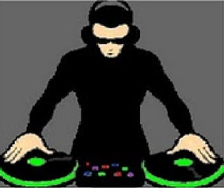 the same logo that is on the digi-pack which is the little DJ man, but on the website we were able to edit the logo to make it look like that disc were spinning around. The logo that we used isn’t the same as the one on the logo as we thought we’d make our own logo that might be more readable, and to link in with the bright green colour scheme.
We decided to use a lot of the bright green colour as it has a large effect and stands out from everything, this makes it more appealing and easier for the viewer to read. I made the link buttons black, so when you roll over them then change to the colour green, this is yet again following the black and green theme that I have tried to use throughout my website and digi-pack. Another area that uses the theme is in the top left corner is the link switcher, I have animated this so it changes between different links, I have also made the writing in green so it’s easy to read and you can see all of the writing. I have made a photo slider, which every so often changes through different images, I have added effects to some of the pictures so it looks more like a cartoon, I thought that the image looked good, and it has linked in with the DJ logo.
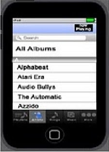 I have created an IPod Touch kind of device on the left hand side that gradually goes through the library to find ‘Dub Fiend’ the artist which then selects the song that plays. I made this last for a certain period as the song gradually starts to play so it looks like that the song is playing as it is selected on the IPod.
I also created a ‘Latest Gigs’ image that is yet again in a bright green colour with white writing, this is because of the grey background, I have used these colours for the writing so they stand out well, as the gig dates are one of the most important things.
I have made the overall layout simple and easy to use so the viewer will like the website, I have also used bright and bold text so the viewer can read all the information easily, so they won’t complain.
I have used the same logo over the website and digi-pack. This is so that the audience and the public will get used to the same logo that they will know who Dub Fiend is. I think that the colours of the overall digi-pack and the website have a good simple layout and colour scheme. I think that the overall detail of information is useful on both the digi-pack and website is good enough for the viewer to understand, who, and what genre of music Dub Fiend is. The Text that I have used on the digi-pack is the actual logo for Dub Fiend, I think that if Dub Fiend’s name grew, the logo for his name will become more popular. I have used the genuine logo as it shows that the digi-pack is a genuine CD made by Dub Fiend, This logo stands out from the rest as it is in a completely different style of text, and colour compared to other artists in this genre of music.
What have you learned from your audience feedback?
Aidan and I received our feedback by screening our music video to the class. All class members would watch the projector screen while the music videos were playing, they would then not down any good points they found about the music video, and then any bad points and improvements they think that the person should do to their video. We each did this for the rest of the classes music videos. I felt that this was useful and helpful as Aidan and I were getting feedback from a few more people. We had also received feedback outside of college through friends and family that we both showed it too.
The feedback given to us was really helpful as I felt that it would help us get a better grade as some of the changes are rather large. Mostly all of the class, friends and family that watched the video said that we had some great shots which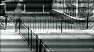 worked well with the video. For example, a lot of the viewers liked the security camera shot as he enters the video, they said that they liked the placement of the camera, but also the visual effects that they saw when the camera first came on, and while he was walking into the shot. Aidan and I were happy with this response back as it was exactly what we wanted, we used this shot as we thought that it would be a great idea to show of the talent we have when using the editing software.
My class mates and teacher also said that they liked the sunset shot which is located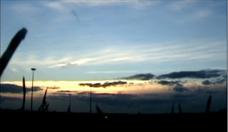 at the end of the music video just as the music is fading out. The feedback that we received from that was great as we positioned the clip in a suitable place that my class mates thought was good and effective. They thought that it worked with the music video and the slowly fading out song.
We then asked Dub Fiend himself what he thought of the video, and he thought that the video was good and had an understandable storyline, he said that a few shots such as the security camera shot and the shots at the party with the strobe lights really worked well with the song. He then told us that we should add more flashback shots when there are long shot as it doesn’t go in rhythm. So we responded to that feedback and changed some of the longer shots and added in a few effects when he is playing his decks. We found this feedback very helpful as he is the person we are doing this music video for and we would like to make it to his standard and what he would like as he is the main target audience for Aidan and I.
Also, some of my class mates told Aidan and I what we need to either re-film or edit again. The shot was the driving scene, they said there is something near the middle of the screen on the windscreen that either looks like a ‘Bird poo’ or a ‘Small crack’. The response to that was to either re-film that or edit the shots so they don’t last as long. So Aidan and I decided that due to the weather conditions and them not being the same as they were due to the snow, so we decided to edit the shot and place other shots that we’ve already used in the music video (repeatability). We managed to make the editing look quick and easy without getting rid of too much of the driving scene. We felt that this overcame some of the problem but not all of it. If the weather conditions were alright and it hadn’t have been snowing, we would have re-filmed this scene to sort the problem out.
Some of my class mates also thought that in another scene of my music video it was a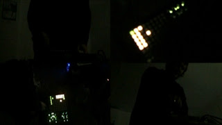 bit ‘boring’ and not a lot was going on. The scene with Dub Fiend split into 4 different screens was the scene that they thought was a bit plain. They thought that the lighting wasn’t great on the shots and thought that he wasn’t doing much in the shots. Aidan and I tried to place the shots in the place that I’d be most effective, we placed it in this place as the sound starts changing, we made him play about with some dials and switches which made it look like he was changing the sound. We tried to increase the amount of brightness my editing the shots and changing the brightness and contrast without making it look to bad, We also tried editing it and trying to add colours into the shots to make it look like he was playing live, but we thought that doing this would make it look tacky as we tried it and it looked bad. We have tried to overcome this problem by changing some effects without making it look to tacky, but because of the shot types, it just ruins what the clip looks like.
Digi-Pack
The feedback that I received for my digi-pack was from my friends, family and Dub Fiend himself. The overall feedback that I received was good overall with a few corrections that Aidan and I did. We took this feedback very seriously as the digi-pack helps to the final grade.
My family said that they thought the colours used were very effective, and the images I used worked well. The CD cover fits in with the genre well with the bright neon green colours and the DJ player on the front. I used the original ‘Dub Fiend’ logo which made the CD cover look genuine. The front of the CD cover was simple, but had all the song information needed and some pictures of Dub Fiend. The inside of the CD cover carried on with the good genuine look. They also said that the information included on the inside was very helpful if they don’t know who Dub Fiend is and what genre of music he produces. They thought that the actual CD was a good layout and the genuine logo of Dub Fiend. They also thought that putting the links to Dub Fiend’s music channels were good as they can follow them to find out latest songs that’s he is producing, and the latest news.

Dub Fiend said that he liked the Inside and the outside of the CD cover, he liked the colour scheme and the front of the CD cover. He thought that the image that I used was good as it is also used on the website. He liked the information that I used on the inside of the CD cover, and also how I used his links to promote him. Overall, he thought that the CD cover was good and was good for the genre of music that he wanted, he said that he liked the overall colour scheme and the information that I included for him. He also then said that he would use the CD cover if he was ever going to bring out the CD cover as he thought that the overall design was good, but he said that he would alter a few things to make it better.
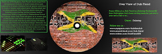
I also received some bad feedback about my CD Cover. Some bad feedback that I received was about the back of the CD Cover. My family and Dub Fiend thought that the back was rather boring as it didn’t include much information, Aidan and I didn’t know what to include on the back so we added a barcode to it. They also thought that the outside of the CD Cover with all the pictures of Dub Fiend wasn’t that good, as it was just a bit plain have a load of pictures of him. We took all of this feedback seriously and had an attempt of changing a few things around the make our Digi-pack the best as possible. I felt all this feedback was helpful to make me complete my digi-pack.
Website
I only had Dub Fiend to look over mine and Aidan’s website as it’s been made for him.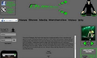 The positive feedback he gave to Aidan and I was that the images and animations worked well with the overall website. He also thought that the overall layout of where Aidan and I placed everything worked well together as it looked neat and tidy. We thought that this positive feedback was very helpful, and helped us develop the layout even more. The negative feedback that he gave to us, was that he thought the text box in the middle of the screen isn’t that big and has a rather large space with nothing in it above it.
So Aidan and I have edited this and made the gap a bit smaller, as we can’t do anything else, due to it being a space that I can’t use anything. And also we have made the text box a bit large so the information inside of it is displayed a bit better. I thought that this feedback was useful as it has helped Aidan and I edit some stuff on our website to make it the best as possible. Aidan and I know that we haven’t made the best website possible due to using the software and problems with it, but we have tried our best to meet the standards that Dub Fiend wants.
How did you use new media technologies in the construction and research, planning and evaluation stages?
At the start of the course in September we were told that we need to find a music track that we were going to use to create a music video for. Our teacher advised up to use a few different websites that had been used before by previous students in the college. A few of us in the class decided to have a little look around on Google for unsigned bands that we could use copyright free music from. As Aidan and I didn’t know what genre of music we wanted to go for this was harder to find some tracks as we didn’t know what kind of song we wanted. So we decided that we should use either Sound Cloud which is a website that is used for either copyright free music or a website where DJ’s place their latest music on to get their name around. But after having the slightest look through the website and realising that it would be very difficult to find a good song that we liked due to the large amount of songs that are on the site. So we decided to start writing a letter that we would send out to a few artists on MySpace asking for the approval to use a song of theirs, as Aidan and I realised the
  bands we wanted to use were huge, we’d have a very small chance of being able to use their music. So we decided to use a track of Dub Fiend’s (my older brother). We found a track that we both liked and thought would be good to make a music video with, so we listened to the song a few times and began to storyboard.
For the video analysis task, I used www.youtube.com to find the music videos that I was going to use. I chose this website as this has a huge amount of different music videos available and to find the music video that I wanted to use it was simple.
During the planning and developing sections, We used digital cameras to take photos of our storyboard as we had finished it to put it onto our media blogs, and also we used the camera’s to take pictures of some location shots that we wanted to use. We used this to remember the shots that we wanted to use and to see what it would look like on the screen.
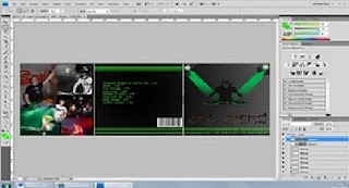 I used Adobe Photoshop to create the images that made my overall CD cover. I found this easy and simple to use, I gradually got used to how to use it as Aidan helped me as he knew how to use the program from Photoshop.
 When I was uploading my Media draft/drafts of my music video, I used www.youtube.com instead of uploading my work straight onto www.blogger.com. I decided this because I already had a YouTube account, and it was quicker and easier to upload to YouTube. When it was uploaded to YouTube I could also let other people watch the video such as friends & family. By using YouTube I have opened up the audience access as any viewers on YouTube can watch the video, this will allow Aidan and I to receive more feedback if the extra viewers leave comments. Aidan and I also used YouTube rather a lot to find out different types of edits and difficult tutorials for complex edits. As we wanted to use some complex edits which will tie in with the music well. We found a few edit tutorials that helped us during the editing stage that we thought helped us create a good music video that ties in well with the music genre.
During filming I used a Song DV camcorder as it was the only camera that was available at the time. I would have preferred using a HD Camera as it would have gave us a better quality image, I think that if I had a better quality camera I would be able to provide a better media project as I would have had more settings to play around with.
The use of the main conventions will be different in each music video as the beats and the style of music are different. Each music video will use the same conventions to keep the viewer on the video, each genre of music will have the same conventions but some will use more, more often. Such as dance music might use faster cutting shots and bright lights more than rock music, as the type of music may be more upbeat. I think that in every music video there has to be a section in the video that has fast cutting shots to keep the viewers entertained so they carrying on watching the music video, by having fast cutting editing they will get through more video clips that they shot so the viewer may understand it more. Also when they use faster cutting editing there will have to be more camera use, which will mean there will be lots of different shot types, angles and zooms. I think that the repeatability of some shots is one of the main conventions in music videos. But in some genres of music videos they will repeat shots more than they do others. I think that music that contains lyrics about loving/missing someone will use repeat shots rather a lot more than dance/dubstep music videos. This is because if they are missing/ love someone they will want to repeat shots that will act like past memories. Another convention that is important to music videos uses the star/artist. Richard Dyers Theory on stars. More professional artists will make sure that they are in the music video as popular artists for R&B, Pop, and Rock genres will have groups of fans that will watch and listen to the music just because the star is involved. But with certain Genres such as dance and dubstep the name of the artist is more important that seeing the artist, this is because DJ’s rely on the music to become more popular than the star image. As DJ’s aren’t used in magazines and music awards as much as the popular artists in the pop music genre. This is because the pop music artist are trying to sell their selves and their music, whereas DJ’s are just trying to get there name around to sell their music and become more popular around the world. But personally, I think that the use of the main media conventions do depend on the genre of the music video as some genres of music will use more fast cutting shots and camera use, and other music videos will use slow long shots that contain more shots of the star, but it depends on the type of music and the beats of the music.Andrew Goodwin’s theory that there is a relationship between the lyrics and the visuals and a relationship between music and visuals are used so that the viewer can listen to the song and have a visual image of what can happen in the music video. This theory is used is mostly all genre types of music videos as a basic outline of the video will be following the lyrics and what is happening in the song lyrics, by having a music video it will just show you what is happening during the music.
The main conventions that are used in the dance/dubstep genre will be fast cutting edits, lots of different camera use and many different camera zooms and angles and it usually is either inside or dark with bright neon lights. The music videos for this genre uses fast cuts as the beat is fast and they try to follow the beats by changing and editing shots quickly to keep the viewer entertained. While cutting quickly they will be using loads of different camera shots, which will involve different shot sizes, zooms and angles, by changing the shots this quickly will help follow the beat and keep the viewer interested. Also while it is doing this it shall be showing other parts of the scenery or other things happening in the background which may be vital to the music video. The reason why dance/dubstep music videos use dark places to film is that when I have watched a music video of this genre they will use shots inside a club while they are DJ’ing. When shots like these are taken they are usually taken when a DJ is genuinely playing, which means they don’t need actors and the dancing isn’t staged. I think that with the dance and dubstep genre, music videos are usually less based on a storyline as these types of music have less lyrics to follow, this is why in the music videos the shots only last for a few seconds at max as everything is fast. Camera use is very important as the angles are important. I think that Richard Dyer’s theory doesn’t fit in with this genre as the star/artist isn’t used that much at all, if anything at all. This is due to the DJ just wanting to get his name around
 so people visit the clubs he/she plays at, some DJ’s are used in their music video, but this is usually a few shots of him playing his decks in front of an audience. Like in my music video, Aidan and I decided to use Dub Fiend himself playing his decks as if he was in front of a crowd.
In some types of music video’s in this genre, Andrew Goodwin’s theory will link into some videos. This is because some music within this genre will have lyrics in, like Aidan and mine, we were able to work with the lyrics and the music to be able to create a visual looking video in our head.
In my media music video, Aidan and I have used a various amount of short and long shot takes and straight cuts. We have decided to these different as the song doesn’t really have story to follow and the beats are difficult to keep in beat with. I have followed some of the main media conventions that other artists use in my genre, such as fast cutting edits at some stages, and also lots of different camera use. Using the camera loads of different ways helps make a clearer video and makes it look more original. I found that the song that I used didn’t have much of a story line to follow, so as the beat changed (during the driving scene), Aidan and I had to decide what we wanted to happen during that area as we felt the filming we had already done for the beginning and ending worked well. In our music video, as one of the actors ‘cheats’ on the actor, we have got a bit of repeatability with shots. I have used these shots to make the storyline clearer to the viewers and to bring out the real meaning of why they are searching for the main actor. Aidan and I have added these shots in these different places as we thought that this is where they are needed the most to make the storyline clearer to all the viewers, we have used these repeated shots as it reminds the viewer what happened in the past and why the actor is doing this.In mine and Aidan’s music video we used Andrew Goodwin’s theory about lyrics and visuals. We used the lyrics “No one's gonna take me alive, the time has come to make things right, you and I must fight for our rights, you and I must fight to survive” Aidan and I felt that we these lyrics were critical to making a music video about fighting for survival, and standing up for themselves. We used these lyrics to create a basic idea of what we wanted to happen in the music video and built on from then. We also felt that the relationship between the music and the video worked well as the fast beats and strange differences in the music meant that Aidan and I were given the opportunity to add in a few odd shots and strange edits as the music ties in with this well.
How effective is the combination of your main product and ancillary texts?
To go with the Music video that Aidan and I created, we were also set to make a website and digi-pack. We wanted to make the website and digi-pack for what Dub Fiend wants, so we asked him what he wanted. We tried to keep the Colour scheme the same between the digi-pack and website, with the bright neon colours. We decided to use
 the same logo that is on the digi-pack which is the little DJ man, but on the website we were able to edit the logo to make it look like that disc were spinning around. The logo that we used isn’t the same as the one on the logo as we thought we’d make our own logo that might be more readable, and to link in with the bright green colour scheme.
We decided to use a lot of the bright green colour as it has a large effect and stands out from everything, this makes it more appealing and easier for the viewer to read. I made the link buttons black, so when you roll over them then change to the colour green, this is yet again following the black and green theme that I have tried
 to use throughout my website and digi-pack. Another area that uses the theme is in the top left corner is the link switcher, I have animated this so it changes between different links, I have also made the writing in green so it’s easy to read and you can see all of the writing. I have made a photo slider, which every so often changes through different images, I have added effects to some of the pictures so it looks more like a cartoon, I thought that the image looked good, and it has linked in with the DJ logo.
 I have created an IPod Touch kind of device on the left hand side that gradually goes through the library to find ‘Dub Fiend’ the artist which then selects the song that plays. I made this last for a certain period as the song gradually starts to play so it looks like that the song is playing as it is selected on the IPod.
I also created a ‘Latest Gigs’ image that is yet again in a bright green colour with white writing, this is because of the grey background, I have used these colours for the writing so they stand out well, as the gig dates are one of the most important things.
I have made the overall layout simple and easy to use so the viewer will like the website, I have also used bright and bold text so the viewer can read all the information easily, so they won’t complain.
I have used the same logo over the website and digi-pack. This is so that the audience and the public will get used to the same logo that they will know who Dub Fiend is. I think that the colours of the overall digi-pack and the website have a good simple layout and colour scheme. I think that the overall detail of information is useful on both the digi-pack and website is good enough for the viewer to understand, who, and what genre of music Dub Fiend is. The Text that I have used on the digi-pack is the actual logo for Dub Fiend, I think that if Dub Fiend’s name grew, the logo for his name will become more popular. I have used the genuine logo as it shows that the digi-pack is a genuine CD made by Dub Fiend, This logo stands out from the rest as it is in a completely different style of text, and colour compared to other artists in this genre of music.
What have you learned from your audience feedback?
Aidan and I received our feedback by screening our music video to the class. All class members would watch the projector screen while the music videos were playing, they would then not down any good points they found about the music video, and then any bad points and improvements they think that the person should do to their video. We each did this for the rest of the classes music videos. I felt that this was useful and helpful as Aidan and I were getting feedback from a few more people. We had also received feedback outside of college through friends and family that we both showed it too.
The feedback given to us was really helpful as I felt that it would help us get a better grade as some of the changes are rather large. Mostly all of the class, friends and family that watched the video said that we had some great shots which
 worked well with the video. For example, a lot of the viewers liked the security camera shot as he enters the video, they said that they liked the placement of the camera, but also the visual effects that they saw when the camera first came on, and while he was walking into the shot. Aidan and I were happy with this response back as it was exactly what we wanted, we used this shot as we thought that it would be a great idea to show of the talent we have when using the editing software.
My class mates and teacher also said that they liked the sunset shot which is located
 at the end of the music video just as the music is fading out. The feedback that we received from that was great as we positioned the clip in a suitable place that my class mates thought was good and effective. They thought that it worked with the music video and the slowly fading out song.
We then asked Dub Fiend himself what he thought of the video, and he thought that the video was good and had an understandable storyline, he said that a few shots such as
 the security camera shot and the shots at the party with the strobe lights really worked well with the song. He then told us that we should add more flashback shots when there are long shot as it doesn’t go in rhythm. So we responded to that feedback and changed some of the longer shots and added in a few effects when he is playing his decks. We found this feedback very helpful as he is the person we are doing this music video for and we would like to make it to his standard and what he would like as he is the main target audience for Aidan and I.
Also, some of my class mates told Aidan and I what we need to either re-film or edit again. The shot was the driving scene, they said there is something near the middle of the screen on the windscreen that either looks like a ‘Bird poo’ or a ‘Small crack’. The response to that was to either re-film that or edit the shots so they don’t last as long. So Aidan and I decided that due to the weather conditions and them not being the same as they were due to the snow, so we decided to edit the shot and place other shots that we’ve already used in the music video (repeatability). We managed to make the editing look quick and easy without getting rid of too much of the driving scene. We felt that this overcame some of the problem but not all of it. If the weather conditions were alright and it hadn’t have been snowing, we would have re-filmed this scene to sort the problem out.
Some of my class mates also thought that in another scene of my music video it was a
 bit ‘boring’ and not a lot was going on. The scene with Dub Fiend split into 4 different screens was the scene that they thought was a bit plain. They thought that the lighting wasn’t great on the shots and thought that he wasn’t doing much in the shots. Aidan and I tried to place the shots in the place that I’d be most effective, we placed it in this place as the sound starts changing, we made him play about with some dials and switches which made it look like he was changing the sound. We tried to increase the amount of brightness my editing the shots and changing the brightness and contrast without making it look to bad, We also tried editing it and trying to add colours into the shots to make it look like he was playing live, but we thought that doing this would make it look tacky as we tried it and it looked bad. We have tried to overcome this problem by changing some effects without making it look to tacky, but because of the shot types, it just ruins what the clip looks like.
Digi-Pack
The feedback that I received for my digi-pack was from my friends, family and Dub Fiend himself. The overall feedback that I received was good overall with a few corrections that Aidan and I did. We took this feedback very seriously as the digi-pack helps to the final grade.
My family said that they thought the colours used were very effective, and the images I used worked well. The CD cover fits in with the genre well with the bright neon green colours and the DJ player on the front. I used the original ‘Dub Fiend’ logo which made the CD cover look genuine. The front of the CD cover was simple, but had all the song information needed and some pictures of Dub Fiend. The inside of the CD cover carried on with the good genuine look. They also said that the information included on the inside was very helpful if they don’t know who Dub Fiend is and what genre of music he produces. They thought that the actual CD was a good layout and the genuine logo of Dub Fiend. They also thought that putting the links to Dub Fiend’s music channels were good as they can follow them to find out latest songs that’s he is producing, and the latest news.

Dub Fiend said that he liked the Inside and the outside of the CD cover, he liked the colour scheme and the front of the CD cover. He thought that the image that I used was good as it is also used on the website. He liked the information that I used on the inside of the CD cover, and also how I used his links to promote him. Overall, he thought that the CD cover was good and was good for the genre of music that he wanted, he said that he liked the overall colour scheme and the information that I included for him. He also then said that he would use the CD cover if he was ever going to bring out the CD cover as he thought that the overall design was good, but he said that he would alter a few things to make it better.

I also received some bad feedback about my CD Cover. Some bad feedback that I received was about the back of the CD Cover. My family and Dub Fiend thought that the back was rather boring as it didn’t include much information, Aidan and I didn’t know what to include on the back so we added a barcode to it. They also thought that the outside of the CD Cover with all the pictures of Dub Fiend wasn’t that good, as it was just a bit plain have a load of pictures of him. We took all of this feedback seriously and had an attempt of changing a few things around the make our Digi-pack the best as possible. I felt all this feedback was helpful to make me complete my digi-pack.
Website
I only had Dub Fiend to look over mine and Aidan’s website as it’s been made for him.
 The positive feedback he gave to Aidan and I was that the images and animations worked well with the overall website. He also thought that the overall layout of where Aidan and I placed everything worked well together as it looked neat and tidy. We thought that this positive feedback was very helpful, and helped us develop the layout even more. The negative feedback that he gave to us, was that he thought the text box in the middle of the screen isn’t that big and has a rather large space with nothing in it above it.
So Aidan and I have edited this and made the gap a bit smaller, as we can’t do anything else, due to it being a space that I can’t use anything. And also we have made the text box a bit large so the information inside of it is displayed a bit better. I thought that this feedback was useful as it has helped Aidan and I edit some stuff on our website to make it the best as possible. Aidan and I know that we haven’t made the best website possible due to using the software and problems with it, but we have tried our best to meet the standards that Dub Fiend wants.
How did you use new media technologies in the construction and research, planning and evaluation stages?
At the start of the course in September we were told that we need to find a music track that we were going to use to create a music video for. Our teacher advised up to use a few different websites that had been used before by previous students in the
 college. A few of us in the class decided to have a little look around on Google for unsigned bands that we could use copyright free music from. As Aidan and I didn’t know what genre of music we wanted to go for this was harder to find some tracks as we didn’t know what kind of song we wanted. So we decided that we should use either Sound Cloud which is a website that is used for either copyright free music or a website where DJ’s place their latest music on to get their name around. But after having the slightest look through the website and realising that it would be very difficult to find a good song that we liked due to the large amount of songs that are on the site. So we decided to start writing a letter that we would send out to a few artists on MySpace asking for the approval to use a song of theirs, as Aidan and I realised the
  bands we wanted to use were huge, we’d have a very small chance of being able to use their music. So we decided to use a track of Dub Fiend’s (my older brother). We found a track that we both liked and thought would be good to make a music video with, so we listened to the song a few times and began to storyboard.
For the video analysis task, I used www.youtube.com to find the music videos that I was going to use. I chose this website as this has a huge amount of different music videos available and to find the music video that I wanted to use it was simple.
During the planning and developing sections, We used digital cameras to take photos of our storyboard as we had finished it to put it onto our media blogs, and also we used the camera’s to take pictures of some location shots that we wanted to use. We used this to remember the shots that we wanted to use and to see what it would look like on the screen.
 I used Adobe Photoshop to create the images that made my overall CD cover. I found this easy and simple to use, I gradually got used to how to use it as Aidan helped me as he knew how to use the program from Photoshop.
 When I was uploading my Media draft/drafts of my music video, I used www.youtube.com instead of uploading my work straight onto www.blogger.com. I decided this because I already had a YouTube account, and it was quicker and easier to upload to YouTube. When it was uploaded to YouTube I could also let other people watch the video such as friends & family. By using YouTube I have opened up the audience access as any viewers on YouTube can watch the video, this will allow Aidan and I to receive more feedback if the extra viewers leave comments. Aidan and I also used YouTube rather a lot to find out different types of edits and difficult tutorials for complex edits. As we wanted to use some complex edits which will tie in with the music well. We found a few edit tutorials that helped us during the editing stage that we thought helped us create a good music video that ties in well with the music genre.
During filming I used a Song DV camcorder as it was the only camera that was available at the time. I would have preferred using a HD Camera as it would have gave us a better quality image, I think that if I had a better quality camera I would be able to provide a better media project as I would have had more settings to play around with.
Sunday, 28 November 2010
Final Website
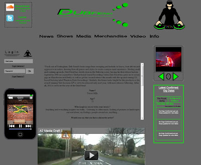
The final website that Aidan and I produced is rather professional to the genre of music, I believe that it is professional to this genre as the images and animations are unique and link into the genre well. I think that the image is unique to different images on websites as a picture of the band or artist would usually go in that place, but instead, we decided a logo should go there.
I believe that we have inserted everything that the artist will want on the website, such as images, music video, song, animations and background information of Dub Fiend. We have also created animations for the photo slider so the photo's change every so often.
The colour scheme of the website works well with all the other images, as its not too dark but not too light. it still contains the colour black and green in which was used in the CD Cover. The writing I have used is simple and plain so its easily read, the logo of " Dub Fiend" at the top of the screen is easy and simple to read too so it shows who's website it is easily.
The layout we used was similar to the one that we designed for our mock website, we followed most of the layout as it went along and did some small alterations as we wanted too, to make our website even better. The layout is simple and easy to follow as everything is clearly labelled and easily located.
The Media that Aidan and I have included in the website is the song "Showdown" which we have used as the song during our music video, this song will automatically play when you enter the website. We have also embedded the Music video of YouTube into the main page so it is able to be watched straight away.
Overall I think that if we had more time we could have spend more time making all the images such as the logo as that isn't the best image on the page. But I think that the website has worked our well and the layout, colour scheme and the contents on the page all work together and make a simple and easily website to navigate around.
Final CD Cover
Front of CD Cover
Click on the image to improve quality
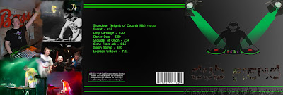
This is Outside image of our Digi pack (Aidan and I). The right hand side is the front cover, The middle of the CD Cover is the back, and the image on the left hand side is the flap that will fold inside of the cover. The images that I have created and used match the type of music and genre the music is. The image of the DJ on the front will show the Customers what type of music it is straight away. The writing of "Dub Fiend" on the front of the cover is the Artists actual logo writing, I have used this to keep it close to the artist and not to make it more how I like it as I need to think of the artist himself and the customers. On the back I have used some of his other songs that he has made including the track "Showdown" which is the song that Aidan and I chose to do our music video to. I have also used a few simple green lines to add some colour to the rear of the CD Cover. the Text I have used it simple to read and sticks out so the customer can read it easily. The multi images on the left of the CD cover shows many different images of Dub Fiend himself Dj'ing and using his equipment and recent gigs, I have chosen to use images of Dub Fiend as he is the artist and I thought using these images might attract more customers to the CD and give customers an image of what the artist looks like.
Inside of CD Cover
Click on the image to improve quality
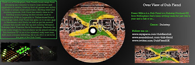
This is the Inside of our Digi pack (Aidan and I). on the right hand side of the CD Cover we have a little bit of background information of Dub Fiend, also followed by Website links that the customers will be able to go on and either follow Dub Fiend to find out latest news and updates, and to also listen to preview of new tracks that the artist is making and the date/dates they are due out. the middle of the CD shows the CD that I have designed, it is just Dub Fiends logo that Aidan and I have edited to make it have the "fish-eye" effect, We then included some writing about the songs and information about the links to follow at the top. And on the left hand side of the CD Cover, I have included Dub Fiends Bio, this is a longish paragraph that was written by Dub Fiend himself, it includes information about his up and coming releases and what he thinks will happen in the future for him. I have also included a few images that I have taken of the APC40 which is a piece of equipment that Dub Fiend uses when doing gigs.
I believe that the colour scheme Aidan and I have chosen is very appropriate for the CD inside and out. We chose these colours as they can bring out the information well and the images we have chosen. The blackish fading to white background with the luminous green writing stands out well to the customers which will help increase sales and increase the popularity of the music.

Click on the image to improve quality
This is Outside image of our Digi pack (Aidan and I). The right hand side is the front cover, The middle of the CD Cover is the back, and the image on the left hand side is the flap that will fold inside of the cover. The images that I have created and used match the type of music and genre the music is. The image of the DJ on the front will show the Customers what type of music it is straight away. The writing of "Dub Fiend" on the front of the cover is the Artists actual logo writing, I have used this to keep it close to the artist and not to make it more how I like it as I need to think of the artist himself and the customers. On the back I have used some of his other songs that he has made including the track "Showdown" which is the song that Aidan and I chose to do our music video to. I have also used a few simple green lines to add some colour to the rear of the CD Cover. the Text I have used it simple to read and sticks out so the customer can read it easily. The multi images on the left of the CD cover shows many different images of Dub Fiend himself Dj'ing and using his equipment and recent gigs, I have chosen to use images of Dub Fiend as he is the artist and I thought using these images might attract more customers to the CD and give customers an image of what the artist looks like.
Inside of CD Cover

Click on the image to improve quality
This is the Inside of our Digi pack (Aidan and I). on the right hand side of the CD Cover we have a little bit of background information of Dub Fiend, also followed by Website links that the customers will be able to go on and either follow Dub Fiend to find out latest news and updates, and to also listen to preview of new tracks that the artist is making and the date/dates they are due out. the middle of the CD shows the CD that I have designed, it is just Dub Fiends logo that Aidan and I have edited to make it have the "fish-eye" effect, We then included some writing about the songs and information about the links to follow at the top. And on the left hand side of the CD Cover, I have included Dub Fiends Bio, this is a longish paragraph that was written by Dub Fiend himself, it includes information about his up and coming releases and what he thinks will happen in the future for him. I have also included a few images that I have taken of the APC40 which is a piece of equipment that Dub Fiend uses when doing gigs.
I believe that the colour scheme Aidan and I have chosen is very appropriate for the CD inside and out. We chose these colours as they can bring out the information well and the images we have chosen. The blackish fading to white background with the luminous green writing stands out well to the customers which will help increase sales and increase the popularity of the music.
6th 9th 11th November 2010
Today we decided to film a shot that would take a long time but be worth it if it came out correctly, we began filming the sky and sun from the top of the hill and waited until it got dark, the sunset lasted about an hour but using the editing software we fast forward it to give the effect of time going quickly, the shot came out exactly how we wanted, with clouds moving across the sky and the sun going down. The use of this shot is so that there is a transition from day to night in the middle of our video, it is also a technical shot and looks very effective as part of our video. This type of shot is used quite a lot in films and extreme sports videos; the shot looks professional and effective boosting the quality of our video. Another shot we filmed was of a car sound system that exaggerates the base, when filming this we played the track ‘Showdown’ so that we could sync the music with the video we had filmed. At college we used editing software to add in the videos we had filmed, we fast forwarded the sunset video and added in the shot of the base as an abstract part of the video. Also we added a blinking effect to the opening point of view shot of the character waking up and walking around his bedroom, as he looks out the window he blinks twice and the shot comes into focus gradually, by doing this we convey the effect of tiredness and that he has just woken up and his eyes are adapting to the light.
30th October 2nd and 4th November 2010
Aidan and I began filming and editing our music video said to the track ‘Showdown’ by artist Dubfiend over three separate days. The day of filming was very successful and a good start to our project. We had checked the weather forecast a few days before we filmed to ensure that the sun was out and would give us the chance to get the best shots possible, the sun needed to be out in order to film our second shot in which there is a tilt of our actor standing there and then becomes a silhouette and the sun gets very bright and rays of light can be seen in the camera lens. A shot that appears to be filmed from a CCTV camera gave us some problems as we could not use the tripod to get a high enough shot to get the CCTV effect, to overcome this we sat on top of a nearby bush shelter and zoomed in, we then kept the camera in the same position and continued filming whilst our character entered a shot and then exited, the shot is very long but with the use of the cut tool and fast forward on the software song Vegas and premier pro, we were able to shorten the shot and make it look more effective and realistic. To get the camera to appear to be a CCTV camera, we used Sony Vegas and changed the shot to the TV effect given on the software. More simple shots such as pans and long shots were time consuming because the lighting in the chosen filming location was dim and quite dull, we overcame this by doing the white balance for each shot and taking a number of shots and angles to give us a large choice of which shot is most effective and looks best for our video. To further the quality of the image, we used Song Vegas again to change the Brightness/ contrast and also the vibrancy, to get a professional looking shot. The final shot we filmed was taken from the back window of a moving car, the idea that we convey with this shot is the feel of paranoia and being watched, the character walks quickly and is followed at the same pace by the car, the shot came out well, but we realised we could see the camera man in the reflection, we then re filmed and earned a professional and effective shot.
Wednesday, 17 November 2010
Monday, 8 November 2010
Monday, 1 November 2010
A2 Music Video First Draft
http://www.youtube.com/watch?v=dxxfk_CTy9g
here is the first draft of mine and Aidan's music video. As you can see from the video we have filmed and edited the current shots that we have taken, we just need to take a few more shots so we can then put the music video all together in place and have all the shots in order.
here is the first draft of mine and Aidan's music video. As you can see from the video we have filmed and edited the current shots that we have taken, we just need to take a few more shots so we can then put the music video all together in place and have all the shots in order.
Music Video Draft
here is the first draft of mine and Aidan's music video. As you can see from the video we have filmed and edited the current shots that we have taken, we just need to take a few more shots so we can then put the music video all together in place and have all the shots in order.
Wednesday, 29 September 2010
Target Audience
The main target audience in which the track and music video is the niche market of dub step. The dub step genre has described as electronic dance music, the use of tightly coiled productions with overwhelming bass lines and reverberant drum patterns, clipped samples, and occasional vocals. Dub step is an underground type of music and rarely seen in the charts as it is a branch off from dance music and not considered to be part of POP music.
Early dubstep
The earliest dub step releases, which date back to 1999, were darker, more experimental, instrumental dub remixes of 2-step garage tracks attempting to incorporate the funky elements of break beat, or the dark elements of drum and bass into 2-step, which featured as B-sides of single releases. In 2001, this and other strains of dark garage music began to be showcased and promoted at London's club night Forward (sometimes also referred to as FWD>>), which went on to be considerably influential to the development of dubstep. The term "dubstep" in reference to a genre of music began to be used by around 2002, by which time stylistic trends used in creating these remixes started to become more noticeable and distinct from 2-step and grime.
A very early supporter of the sound was BBC Radio 1 DJ John Peel, who started playing it from 2003 onwards. In 2004, the last year of his show, his listeners voted Distance, Digital Mystikz and Plastician (formerly Plasticman) in their top 50 for the year. Dubstep started to spread beyond small local scenes in late 2005 and early 2006; many websites devoted to the genre appeared on the internet and thus aided the growth of the scene, such as dubstepforum, the download site Barefiles and blogs such as gutterbreakz. Simultaneously, the genre was receiving extensive coverage in music magazines such as The Wire and online publications such as Pitchfork Media, with a regular feature entitled The Month In: Grime/Dubstep. Interest in dubstep grew significantly after BBC Radio 1 DJ Mary Anne Hobbs started championing the genre, beginning with a show devoted to it (entitled "Dubstep Warz") in January 2006.
This information was used from Wikipedia to show artist that are popular in dub step and also where it started
Music video target audience
The music video could also be aimed at a separate target audience as there is not many dubstep music videos due to the niche market in which it is aimed at. By creating a music video that has themes that relate to the life of teenagers and the type of life and society they are growing up in will then link to a wider audience of teenagers, mainly aimed at male teenagers, the music video and track is still relevant to the female gender, class and race is not important as teenagers from different backgrounds and cultures still have the same problems and difficulties growing up despite background and culture. If the audience can relate to what they see in the video and the lyrics that are used in the track then the track and video will branch out to cover a greater target audience.
Muse target audience
The track that has been mixed is muse knights of cydonia, by using a famous track that has been mixed into a dubstep track, the huge fan base that follow muse will be interested to see what our artist has done with that track and his interpretation of the lyrics, after the music video is put to the track the audience will also be able to see the interpretation of what the lyrics are trying to say, and why they are portrayed in this way through the video. Muses target audience of late teens onwards to over 30’s follow the band for their new ideas and original sound, as muse is quite modern pop rock the people who enjoy listening to them will be interested to find out what other people have done with the bands tracks and the way in which they have sampled and mixed them, giving our track and music video a less niche target audience and quite a main stream one. Not all of the lyrics from the original muse song are used in the remix by ‘dubfiend’, but the lyrics that are used give the outline to the original track and still convey the lyrics message.
No one's gonna take me alive,
The time has come to make things right,
You and I must fight for our rights,
You and I must fight to survive,
No one's gonna take me alive,
The time has come to make things right,
You and I must fight for our rights,
You and I must fight to survive
In conclusion I believe that the target audience that we will be aiming our product is 16-35, I believe the people that will be most interested in the sounds and images that have been created are music lovers that are interested in new sounds of music and fans of the underground dub scene.
Friday, 24 September 2010
Kings of Leon Website Analysis
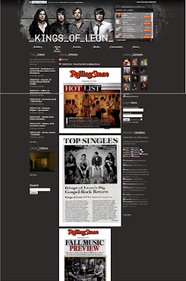
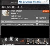
This image above sows you the offical Kings of Leon website. This website is laid out so there is a picture of the whole band at the top of the page and that is the first thing you are able to see, to the right of that there is music play that allows you to play the song, there is also a link after that where you are able to purchase the song , on that screen there is a menu of the choice of song you would like to buy if not both of them. This then gives you the choice of either buying just the one item or both of them.
Just below the image there is a bar with different links that you can press that will have different information about the band, some of the links will contain different information about the band like latest articles and events and gigs that the bands are playing soon in the future. Under some of the bars another drop down menu comes down from that and you are allowed a choice of what you want to look at in that area, e.g. if you go under the “Events” bar a drop down menu with two options, one saying “Tour” and the other saying “appearances”. This then gives the user a different choice of what they can look at and makes the website easier to navigate around.
Down the main part of the screen there are different images and articles made which then promotes the Band, also they include it on their website to then show of the latest articles made about them.
To the right of that it says “latest Uploads” which allows the users to upload the latest images of the band playing; most of the images uploaded are from the band playing at live events.
And to the left hand side of the page you can see the section where it says “Tour Dates” this allows the user to quickly look at the latest tour dates easily instead of having to go through different links through the page.
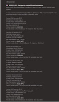
I then scrolled down the page slightly and found this, it says what shows in Europe have been announced, and then is gives you all the information about what time it is, and what day its on, it also tells you when the tickets are on sale and where at, but also it tells you there’s a 48 Hour presale, where you are able to purchase tickets before anyone else.
I think that this website overall is a good website as it includes information about the band, the latest articles written about the band and tour dates etc, I think this is helpful for the user as they will be able to keep up to date with what it happen with the Kings of Leon and find out the latest information about them. I also think the buying and listening to the music on the website is very helpful because it lets the user listen to the music before they are able to purchase it at the highest quality. I also think that the store is very important to have on a website like this as it sells inetesting items like t-shirts and clothing items that every Kings of Leon fan wants to own.
Overall, I think this website is very easy to use and contain a lot of recent and relative information, it also has the extra features that some websites don’t include, so I think this website is very good and I would like Aidan and mine to be similar so the user finds it easy to navigate around the website.
Mock CD Cover
CD Cover Analysis
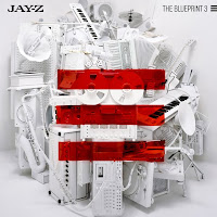
This Cd cover is a picture of different types of technology that will help make the music that Jay-Z makes; they might have done this as there are different types of music equipment in this photo that ranges in different time ranges. The silver cover makes the Cd case stand out and the three lines in the middle of the Cd case carries on through the different Albums that Jay-Z makes, because he has Blueprint 1, Blueprint 2 and this one is Blueprint 3. This album cover with the red lines might show that Jay-Z’s genre is usually around the same as other Hip Hop rapper but his has a different style, and the red lines might show this.
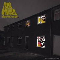
This Cd cover is a picture of a block of flats with a one flat that has windows full of colours and shapes. The Arctic Monkeys could have done this to show a new style of music that they are making, as they had already made an album before this, the writing of “Arctic Monkeys Favourite Worst Nightmare” is in a rather technological way as it is using a different and abstract font, this might also then link to the different style of music that they are making. The dark grey colours with the bright white and pink and yellow colours make that one house stand out which might show that the Arctic Monkeys will stand out more from the crowd as the music will be popular.
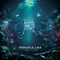
This Cd cover is a picture underwater with two naked people who are touching hand together, also in the background and foreground there are plants and fish watching them with a ray of light spearing through the water. This is an abstract and strange album artwork as it is unusual, but I think that they have created this album artwork like this as they are making different unique types of music than they have done before due to the strange artwork. The colours are bright and very dominant, they have used these colours to attract the user to the album. They might have also created this album artwork as one of the songs on this album is called “Watercolour” this may reflect on the album artwork.
Location Planning & Research
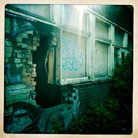
The outside and inside of this building will be used several times throughout our video, it will be used as a place of retreat for the character in the video. The run down and broken building will symbolise the way in which the boy is feeling and that he feels lonely and not looked after much like the building featured in the photograph. The dark interior of the building will be used as a place to sit and ponder by the boy, in order to get a good shot and for the image to look effective we will have to use artificial lighting as well as sun light to ensure the shots come out well.
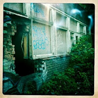
The holes due to missing bricks in the building will be carefully used to capture rays of light shining through them. A dolly cam will be used so that the camera travels smoothly along the floor and shows different lights coming through holes in the wall. One of the more advanced shots will be creating a ray of light shining down from the roof on to the character, created either by natural or artificial light to create a feeling to the audience of inspiration and a change in the characters feelings.
Required Items List
Filming Equipment
-Video Camera
-Tripod
-Blank Tape
-Digital Camera
Props
-Mobile Phone
-Car
-Shot Glasses
-Money
Actors
-1 Main Character (Male)
-8 Backing Characters (Male & Female)
Costume
- Main character - Dark Jeans, Hoody, T-shirt, Skateboard Shoes
- Backing Characters - Jeans, T-shirts etc
Computer Software
-Adobe Photoshop
-Adobe Dreamweaver
-Adobe Premier Pro
-Adobe After Effects
Props Research
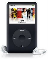
iPod Classic- The use of the iPod is that this is that it is used for a close up during the video. The character presses play on the iPod just before the music begins to play, as he presses it the beat starts linking to the next scene of him walking away.
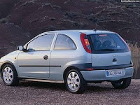
Although the outside or interior of the car is not featured actually in the video it is still vital for the shots we get that we have a car to do so. Shots through the windscreen of the car at night time will be sped up in order to give the effect of time passing quickly. A shot of the character from the window of the car will also be used to show people are watching him as he stands on his own.

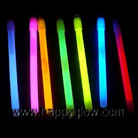
Shot glasses will be used during the party scene, there is a flashback as the character walks down the side of an abandoned building of a rave that he had been to before. The colourful glasses with look opposite to the characters clothing and expression depicting that he doesn’t fit in and is a bit of a loner. The glow sticks will also do the same and should shine really nicely in the dark and hopefully create a great shot for the music video.
Actor & Costume Research

Joe Alman- 17 years old
The actor we will be using is Joe Alman, from our planning of the music video; Joe fits the description of the character we would like to portray in the video. Joe also has acting experience from his previous school and we believe could play the part in the video very well, to make the character act real and also capture the feelings we are trying to portray within the music video.
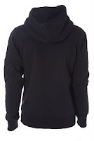
We would like the character to wear a dark coloured hoodie much like the one seen in the photograph. The hood should be up and partly covering his face to show the characters loneliness and self consciousness. By having a dark coloured jacket, it sticks to the dark themes of the video and will also come in handy when trying to capture only the characters face in shots that are more dark.
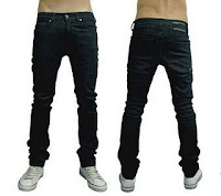
The character in the video will also be wearing dark skinny jeans as this shows originality etc. Again also sticking to the theme of darkness.
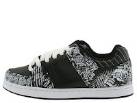
The character will where trainers that are used for skateboarding, this gives an idea to the personality of the character and what he enjoys doing. Again the shoes will be dark sticking to the theme.
The Song
Showdown (Muse - Knights of Cydonia Remix)
The song that we will be doing is a dub step track by Dub fiend and underground artist popular in the dub step genre. The lyrics to the track are vital as they link in to the music video.
No one's gonna take me alive,
The time has come to make things right,
You and I must fight for our rights,
You and I must fight to survive,
No one's gonna take me alive,
The time has come to make things right,
You and I must fight for our rights,
You and I must fight to survive
(solo)
No one's going to take me alive,
The time has come to make things right,
You and I must fight for our rights,
You and I must fight to survive.
The video features a teenage male who is struggling to fit in, shots featured in the video are of the character falling out with friends and his girlfriend. The link to the lyrics for this bit is the change of mind from the character as he realises he needs to sort things out to be happy, this takes place as the lyrics sing “the time has come to make things right”
The end shot is of the character standing looking at the bright sunset thinking about what he must do in order to make things right again. The character must put effort in so that he can live his life happy. This fits to the lyrics “you and I must fight to survive”
The genre of dub step is difficult to picture a video for, but with it being a remix and the lyrics having such a strong message it was simple to think up a storyline and character.
Subscribe to:
Comments (Atom)


